How should you decorate an office or gaming room with a circuit poster?
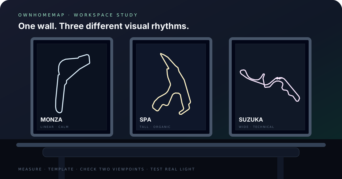
To place a circuit poster in an office or gaming room, begin with the real wall rather than an inspiration photograph. Measure the open area, view it from the chair and doorway, then choose an outline whose density remains readable from both positions. Monza brings long directions and a restrained composition; Spa naturally fills vertical space; Suzuka creates a more technical mark through its crossover. Build a palette that works in ordinary room light, not only under LEDs: background, route and text should remain separate when colored lighting is off. Use the protected OwnHomeMap preview to inspect that hierarchy before paying. Confirmed payment provides the high-resolution PNG without the preview watermark. For an eligible circuit, the cart can also add one A4 or A3 portrait print; framing remains a separate decision based on the measured wall. A deliberate test with a paper template is more reliable than choosing a size from an isolated product image.
Enthusiast decor does not need to turn a workspace into a themed set. A circuit route can function as a clean graphic line: meaningful to someone who knows the place and quiet enough to share a room with work equipment, books or other art. This guide focuses on room decisions — proportions, density, palette, groups and file preparation. For a broader shape comparison, read Which racing circuit poster should you choose?.
1. Audit the wall before choosing a circuit
Record three measurements first: available width, available height and the typical viewing distance. List everything that already occupies the same visual field, including monitors, shelves, acoustic panels, lamps, speakers and frames. Artwork that appears modest in a product card can dominate a narrow desk wall; the same design may look lost on a large empty surface.
Take a straight-on photograph and sketch a rectangle with the file’s proportions. The Grand Prix PNG follows a vertical A2 ratio. A sheet of paper or low-tack masking-tape template lets you test the area without drilling. Look at the empty margin around the rectangle. A route with many close turns needs enough separation from nearby cables, shelves and objects to preserve its shape.
Check two viewpoints. From the chair, the poster can reveal small details and a personal line. From the entrance or camera position, it becomes one overall silhouette. If secondary text attracts attention at close range while the route disappears from farther away, simplify the visual hierarchy.
Finally, note the lighting conditions that actually occur: daylight from a side window, ceiling light, desk lamp and colored LEDs. There is no single correct palette for every room. The useful test is whether the artwork remains understandable in each condition in which you will see it.
2. Match the route shape to the wall geometry
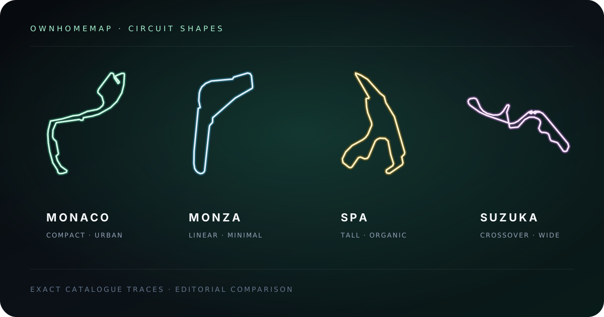
Circuits do not occupy a portrait frame in the same way. Their physical length does not directly predict their graphic presence; orientation, repeated returns and negative space matter more on the wall. The examples below use normalized OwnHomeMap traces checked against the operator pages in the source section.
| Circuit | Graphic structure | Suitable wall situation | Preview check |
|---|---|---|---|
| Monza | Long directions, compact chicanes and a narrow return | Calm wall above a desk | Small direction changes must remain visible |
| Spa-Francorchamps | Tall loop with open areas and grouped curves | Vertical strip between furniture | The route needs breathing room from top to bottom |
| Suzuka | Wide shape, crossover and tight sequences | Clear wall or central frame | Both crossover branches must remain distinct |
Monza helps when screens, peripherals or shelves already add considerable detail. Its main directions read quickly and create a more restrained result, although the chicanes still need enough contrast to avoid disappearing.
Spa uses more of the poster’s height. It can occupy a narrow gap without becoming a tiny mark centered in a large frame. The open sections accept a quieter route color, provided that the denser groups still separate cleanly.
Suzuka reads almost like a technical diagram. Its crossover attracts attention and benefits from a clear perimeter. If the wall already contains several objects, increase the space around the frame so the route does not visually connect with unrelated lines.
3. Build a palette that works during work and play
Gaming rooms are often photographed with LED lighting, but they are not used only in that state. Start with a combination that works under the room’s everyday illumination. Background, circuit name, route and optional line should form a clear order. Switch on colored lighting afterwards and check that its hue does not make the route blend into the background.
In a bright office, a mid-tone or light background may prevent a large dark rectangle from becoming the dominant object. Charcoal, deep blue or copper lines can create a quieter presence. In a darker setup, a deep background and light route are easy to identify, but keep secondary type less intense than the circuit itself.
For a mixed work-and-gaming room, take an accent color from a durable object such as a chair, cabinet, shelf or rug. A rapidly replaced peripheral or animated screen is a weaker foundation. Two main colors and one restrained accent usually connect the poster to the room without turning it into a rigid theme.
It is possible to evoke metal, forest, coastal light or a night city without copying a commercial identity. OwnHomeMap sells a customizable route-centered composition and does not present the artwork as merchandise licensed by a team, championship or circuit.
4. Position the frame in relation to screens and furniture
The artwork does not need to be centered on the entire wall. It should align with the visible arrangement: desk width, monitor group, cabinet or chair backdrop. If the desk sits to one side, centering the frame over the working zone often looks more intentional than placing it at the midpoint between unequal empty areas.
Above a monitor, preserve a visible gap so the frame does not look like an extension of the screen. On a side wall, a portrait composition can guide the eye towards the workspace without competing with the main display. Use the tape template to compare both positions before choosing fixings.
For video calls, inspect the actual camera frame. A circuit cut by the edge can become an unexplained line. Move the art or widen the view until the complete silhouette is visible. This direct test is better than a universal placement rule because camera height, lens and desk layout differ.
Avoid positions exposed to persistent reflection, direct heat or significant moisture. Those conditions matter for any physical presentation, including an optional A4 or A3 print selected in the cart and any frame chosen separately.
5. Decide between one statement piece and a circuit wall
A single poster works when one circuit holds a strong memory or the room already contains several visual elements. Give it a generous perimeter and repeat one color elsewhere in the space. The hierarchy remains simple: route first, furniture and equipment as context.
A pair or trio works when every route has a distinct reason to be present. Keep the same ratio, margin system, type treatment and palette rule. The circuits may use different accents over a shared background, or one route color across different backgrounds. Avoid changing frame style, typography, scale and color logic all at once; without a repeated rule, the group looks accidental.
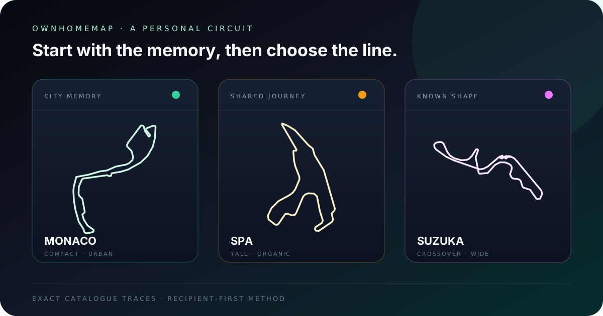
Before buying a pack, write the role of each circuit. “First trip,” “favorite route” and “weekend with friends” create a narrative. Three shapes chosen only to fill wall width resemble a catalogue rather than a personal collection. Confirm the item count and price displayed in the cart; after confirmed payment, each purchased design remains separately identifiable for download.
6. Prepare the file for the intended output
The final PNG measures 4961 × 7016 pixels and follows A2 proportions. For a 42 × 59.4 cm, or 16.5 × 23.4 inch, output at 300 DPI, send the original file and ask the provider to disable automatic cropping. A smaller print is possible when the ratio remains unchanged. Do not enlarge a screenshot or use the protected preview because neither is the delivered product.
Paper affects the result. Matte stock reduces visible reflection in a room with several light sources. A satin surface may increase perceived contrast but can show windows and lamps more readily. Ask for a proof when bends are small or when the palette depends on neighboring tones with limited contrast.
Review Quality and product information for the file contract and How it works for the confirmed ordering flow. Every circuit order includes the digital PNG; where the cart offers A4 or A3, the print size is selected per circuit and delivery details are collected at checkout. A frame and mounting remain separate choices.
7. Add personal text without breaking the composition
In a workspace, a long message may feel meaningful from the chair but visually heavy from the doorway. Limit the line to a date, place, name or short dedication. Keep it below the route instead of filling an internal loop so the circuit remains readable as one shape.
Inspect the text at both intended distances. If it attracts attention before the circuit, shorten it or reduce its contrast. If it disappears completely even though you want to read it from the desk, increase separation carefully without competing with the circuit name.
A memory-based phrase ages better than a temporary result. “Spa · our first trip” remains understandable without maintenance. It also keeps the wall personal rather than turning it into a dated event notice.
8. Use a final checklist before ordering and printing
Confirm each point before you proceed:
- The wall has been measured and the vertical ratio tested with a template.
- The circuit has a clear memory or genuine visual preference behind it.
- The route remains readable from both the chair and doorway.
- The palette works in ordinary light and with LEDs.
- Optional text is accurate, concise and quieter than the route.
- You understand the digital product, any selected A4 or A3 print option, the current cart price and item count.
- The selected print size or your own print provider can preserve the ratio without cropping.
- The frame and surface suit the room’s actual reflections and light.
This check takes less time than correcting a poorly cropped output. It also turns a broad inspiration image into a decision grounded in your own room.
Sources and method
Editorial review: 2026-07-29. We compared normalized OwnHomeMap catalogue traces inside the same portrait frame and separated graphic observations from geometric facts. The route shapes and configurations were cross-checked against primary pages maintained by the three circuit operators. Placement guidance follows a repeatable first-party method — wall measurement, ratio template, two viewpoints and checks under real lighting — rather than an invented universal design rule.
- Monza circuit — current layout
- Circuit de Spa-Francorchamps — history and configuration
- Suzuka Circuit — official course guide
The opening illustration uses the three exact normalized product traces in a frame comparison. It is not an interior photograph, access map or statement of affiliation with the circuit operators.
Frequently asked questions
Which circuit works well above a desk?
A route with clear directions that remains readable from a distance, such as Monza, suits a calm composition; Spa uses more vertical space; Suzuka creates a more technical shape. The best option still needs to fit the wall width and carry a personal connection.
Should the poster match the room’s LED lighting?
Treat LEDs as one viewing condition, not the only reference. Check the poster in the room’s ordinary light and preserve sufficient contrast between the background, route and text when colored lighting is switched off.
Does the circuit poster arrive as a physical print?
Every confirmed Grand Prix circuit order includes a high-resolution PNG without the preview watermark. For an eligible circuit, you can also select an A4 or A3 portrait print in the cart; checkout then asks for the delivery details needed to send that selected print. A frame is not included.
Build the wall around a real route
Once the area is measured, open the Grand Prix Collection and compare Monza, Spa, Suzuka or other available circuits using the same palette. If the design will be given to someone else, continue with What gift should you choose for a motorsport fan?. The room will feel more coherent when the chosen line stays readable, belongs to a real story and works in daily light rather than only in one staged photograph.
The Grand Prix Collection
Browse each track and personalize its poster with the colors of your choice.
Explore the circuits