Which racing circuit poster should you choose?
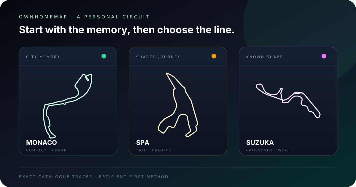
The right racing circuit poster starts with a line that already means something to the person who will see it. Begin with the memory — a visit, a race watched with family, a favorite city or an instantly recognizable outline — and then compare that shape with the wall where it will hang. A compact circuit such as Monaco forms a dense focal point; a tall outline such as Spa naturally suits a narrower wall; Suzuka brings a graphic crossover; Monza offers a more minimal reading. Next, check the contrast between the background, circuit and text from the room’s real viewing distance. OwnHomeMap provides a protected preview for that decision before payment. The product is digital: after payment is confirmed, each purchased design can be downloaded as a high-resolution PNG without the preview watermark. Let the circuit, palette, optional personal line and intended room guide the choice, rather than a temporary sporting ranking or season result.
A circuit poster is not a race photograph or an event calendar. It is a graphic composition built around one continuous route. Two circuits may carry equal personal importance while creating completely different effects on a wall. This guide gives you a durable method for comparing the designs currently available in the OwnHomeMap Grand Prix Collection, without relying on a schedule or result that will become outdated.
1. Start with personal relevance, not fame
The strongest reason is one you can explain in a single sentence: “we discovered this place together,” “this was the first circuit my father showed me,” or “I used to draw that shape as a child.” That sentence gives the artwork a purpose. It also suggests the optional text: a visit date, two names, a place or a few words will usually do more than a long dedication.
When choosing a gift, look for direct evidence before buying. A photograph from a visit, a saved ticket, a city the recipient often mentions or another object already in their collection is more reliable than guessing from the circuit’s fame. If no single memory stands out, use geometry as the second filter. Does the recipient prefer minimal objects, technical drawings or highly detailed compositions?
This method also keeps the design from becoming dependent on a driver, team or one edition of an event. The circuit line and a personal message remain understandable when championships, participants and sporting colors change.
2. Compare the outline before choosing colors
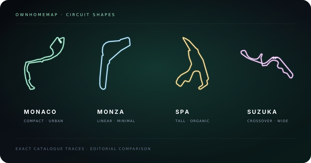
Look at each circuit in one color first. If the silhouette already holds your attention without extra decoration, it is more likely to retain its presence in a restrained palette. The four examples below are not a ranking. They represent contrasting families of shape, using geometry and history checked against the circuit operators listed in the Sources section.
| Circuit | Graphic character | Room or use it often suits | What to inspect in the preview |
|---|---|---|---|
| Monaco | Compact, urban and asymmetric | Small office, Monaco travel memory, mixed gallery wall | Closely grouped direction changes should remain separate at small scale |
| Monza | Long directions, sharp interruptions and a narrow return | Minimal interior, strongly vertical composition, bold typography | Chicanes should not disappear when contrast is reduced |
| Spa-Francorchamps | Tall organic loop with open and compressed areas | Narrow wall, office, decor inspired by a forest landscape | The route needs breathing room across the complete poster height |
| Suzuka | Wide structure with a crossover and linked curves | Gaming room, contemporary wall, technical-design enthusiast | Both branches of the crossover must stay clearly distinct |
Monaco: a dense shape that draws the eye closer
Monaco uses urban roads and links very different spaces within a small footprint. That origin creates a compressed line with frequent direction changes. On a poster it behaves almost like an architectural detail: viewers move closer to follow the route. A light line against a dark background helps the smaller bends stay readable, particularly when the artwork is seen from the opposite side of a desk.
Monza: the strength of long directions
Monza places long sections beside compact chicanes and a broad final curve. Its silhouette appears to travel from one end of the page to the other rather than turn repeatedly around one center. It therefore works with a very restrained layout. If the room already contains many objects or photographs, that clear direction can create movement without adding another visually heavy block.
Spa: a line shaped by its terrain
Spa-Francorchamps developed from roads and elevation in the Belgian Ardennes. The modern circuit reaches 7.004 km according to the venue’s official timeline. Its outline naturally uses height and alternates broad breathing spaces with tight groups of bends. Slate, forest, mist or copper colors can support that landscape character without claiming to reproduce a sporting identity.
Suzuka: an unmistakable crossover
Suzuka’s official course guide lists 5.807 km and eighteen corners for the four-wheel route. Its crossover gives unusual depth to a flat image: two axes overlap visually without joining. The overall line is broad and almost calligraphic. Give it enough open wall space so the horizontal movement and bridge area do not feel compressed.
3. Choose color for the real viewing distance
Personalization is not simply selecting a favorite color. A palette must preserve a hierarchy between background, circuit, location name and optional dedication. Inspect the preview up close, then reduce the window or step back. The main silhouette should still appear before the secondary text does.
In a dark room or gaming corner, a deep background with a clear line can create a defined focal point. In a bright living area, a medium or lighter background may prevent the poster from becoming an overpowering black rectangle. In an office, two or three colors are usually enough: one for the field, one for the circuit and one restrained typographic accent. Too many competing contrasts turn the route into just another element.
You can take inspiration from an atmosphere — coast, forest, metal or night light — without copying a recognizable competition color scheme or presenting the artwork as affiliated merchandise. OwnHomeMap sells a customizable graphic design centered on the route. It is not licensed by a championship, team or circuit.
4. Match the poster to the room
In an office
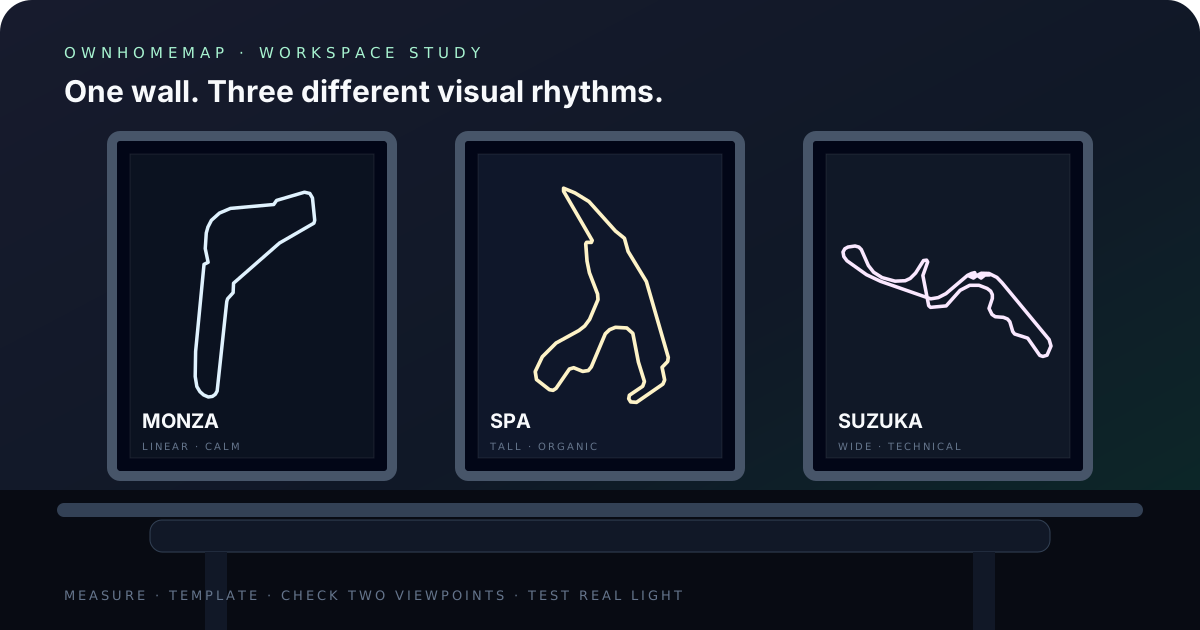
Artwork above a monitor should remain legible without becoming the room’s only bright object. Choose a route whose detail survives viewing from two or three meters away and keep personal copy short. A date or place name is enough. Monaco creates a dense area, Monza gives a calmer direction, and Spa makes greater use of height.
In a gaming room
A higher-contrast palette can work with the room’s lighting, but also test the preview as though the LEDs were switched off. The design should keep its balance under normal light. Suzuka suits a technical composition because of its crossover, while Monaco and Spa offer denser shapes.
On a gallery wall
Measure the available opening before choosing. If nearby prints already use strong colors, keep the circuit palette neutral. A repeated background or type treatment can connect several posters without suggesting that they form an official series. In a group of frames, consistent margins often matter more than making every color identical.
As a gift
Personal text should identify the memory without explaining the entire story. “Monaco · May 2024,” “Our first trip,” or two names provide a reference point; a full paragraph will compete with the circuit. Check spelling, date and accents before confirming. The final file reflects the personalization attached to the order.
5. Know exactly what the product delivers
Every confirmed circuit order includes the high-resolution PNG for each purchased design, without the watermark used on the preview. Before purchase, the shop displays a protected preview so you can inspect the composition while the design remains protected. For an eligible circuit, the cart can also add one A4 or A3 portrait print; the digital file remains included, and checkout requests delivery details only for that selected print. A frame is not included.
The final file measures 4961 × 7016 pixels. Its proportions match A2 and contain enough pixels for printing at 42 × 59.4 cm, or 16.5 × 23.4 inches, at 300 DPI. Those are properties of the OwnHomeMap file, not a promise that every printer will create the same physical result. Paper, ink, color profile and provider settings still affect output.
The Quality and product information page records the digital-file contract. How it works explains the confirmed order journey. These maintained references are safer than relying on a screenshot or an old product description copied elsewhere.
6. Prepare the file for printing without damaging the route
Download the original PNG from the order page and keep an untouched copy. Do not send a screenshot, the protected shop preview or a version passed through a messaging service that may compress it. Ask the print provider to preserve the file ratio and disable automatic cropping. If the service adds bleed, inspect its proof to confirm that the circuit, name and personal line remain fully inside the visible area.
For A2 output, specify 42 × 59.4 cm, or 16.5 × 23.4 inches, in portrait orientation. A smaller print is possible when the file is reduced proportionally. Before ordering a large print, request a proof or make a small test. Backlit screens often make colors appear brighter than paper. Matte stock reduces reflections, while satin stock may strengthen contrast. For the optional A4 or A3 cart print, review the selected size and delivery details before payment; for a different format, choose the paper and provider yourself.
7. Use a five-minute decision method
If several circuits appeal to you, assess each candidate against four simple questions rather than inventing a complex score:
- Personal link — can you explain in one sentence why this circuit matters?
- Silhouette — does the line still appeal in monochrome and at a small size?
- Room — do its orientation and density suit the open wall area?
- Palette — do the colors remain readable in the room’s normal light?
- Text — do you have a short, accurate dedication that will still make sense later?
Remove any choice that fails on personal relevance or legibility. Compare the remaining candidates using the same palette. Equal conditions reveal outline differences more clearly than a grid where every circuit uses unrelated colors. If several memories belong together, a pack may make sense; always confirm the item count and current price shown in the cart before paying.
8. Avoid the most common mistakes
The first mistake is choosing a circuit only because it is famous. Without a memory, visual preference or specific recipient, the poster may remain decorative but impersonal. The second is using insufficient contrast. A palette that looks refined at full zoom can make chicanes and crossover lines disappear from the doorway.
The third mistake is adding too much copy. The circuit should remain the main subject. The fourth is printing the preview instead of the final file: the preview is protected and is not the delivered product. Finally, do not crop the PNG to force it into a frame with a different ratio. Select a suitable format or ask the print provider to add borders without cutting the composition.
Sources and method
Editorial review: 2026-07-29. We separated two types of information. Route geometry and historical context come from primary pages maintained by the circuit operators. Delivery characteristics come from the OwnHomeMap rendering and order contract tested in the application. No current racing calendar is used to recommend one outline over another.
- Automobile Club de Monaco — history
- Monza circuit — current layout
- Circuit de Spa-Francorchamps — history and configuration
- Suzuka Circuit — official course guide
The opening illustration reuses OwnHomeMap’s normalized catalogue traces. It compares silhouettes; it is not a site boundary, access map or statement of official affiliation.
Frequently asked questions
Which circuit should you choose for a motorsport gift?
Start with the circuit connected to a specific memory, a visited city or an outline the recipient recognizes immediately. Then adapt the palette and optional personal line to the room where the poster will be displayed.
Does the downloaded circuit poster have a watermark?
The preview displayed before purchase is protected by a watermark. Once payment is confirmed, the downloadable high-resolution PNG does not contain that preview watermark.
Can the file be printed at A2 size?
The final PNG measures 4961 × 7016 pixels and follows A2 proportions. It contains enough pixels for printing at 42 × 59.4 cm, or 16.5 × 23.4 inches, at 300 DPI when its ratio is preserved and automatic cropping is disabled.
Compare the available circuits
The most useful final step is to open the Grand Prix Collection and compare two or three circuits with the same palette. You will quickly see whether you prefer a compact line, a tall organic loop, a minimal direction or a technical crossover. Keep the memory at the center of the choice: it is what will give the poster meaning after the room’s colors or decor have changed.
The Grand Prix Collection
Browse each track and personalize its poster with the colors of your choice.
Explore the circuits